 As many of his readers may have noticed
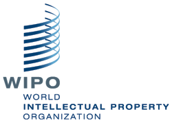
, while the Kats were at play yesterday, celebrating World Intellectual Property Day, the World Intellectual Property Organization (WIPO) unveiled its new logo. According to WIPO's
press release,
"The new logo reflects the Organization’s dynamism and innovative spirit [Merpel asks mischievously, is that why there's a huge empty space in the middle of it?], and is a powerful symbol of WIPO’s revitalization and strategic reorientation [?]. It is based on a graphic representation of the WIPO headquarters’ building [prior art!], an iconic structure familiar to all WIPO member states and stakeholders. The color blue links the Organization with the United Nations [and Chelsea Football Club: click here for a stirring rendition of "Blue is the Colour"]. The seven curved lines represent the seven elements of IP, as set out in the WIPO Convention:
* literary, artistic and scientific works,
* performances of performing artists, phonograms, and broadcasts,
* inventions in all fields of human endeavor,
* scientific discoveries,
* industrial designs,
* trademarks, service marks, and commercial names and designations,
* protection against unfair competition, and all other rights resulting from intellectual activity in the industrial, scientific, literary or artistic fields [doesn't leave much out, does it?].
The gathering sweep of the curves is inclusive - WIPO is an open forum, welcoming all stakeholders and points of view. The dynamic, upward pitch of the curves represents ideas, movement, and the progress which comes from innovation and creativity. This rests on a strong foundation, the name and acronym of the Organization, representing its long-standing role at the center of international IP policy. The logo’s clean modern lines reflect the trust, reliability and efficiency which are key to WIPO’s corporate image".
The IPKat, who actually quite likes the new logo and really didn't care much for the old one, has resisted the churlish urge to invite readers to seek out any earlier registered marks that use similar curves, but is instead happy to offer a complimentary one-year electronic subscription to the
Journal of Intellectual Property Law & Practice (
JIPLP) to anyone who can suggest the best alternative explanation of the logo to what offered by WIPO itself. Entries, please, to the IPKat
here, by close of play on Sunday 30 May.
 As many of his readers may have noticed, while the Kats were at play yesterday, celebrating World Intellectual Property Day, the World Intellectual Property Organization (WIPO) unveiled its new logo. According to WIPO's press release,