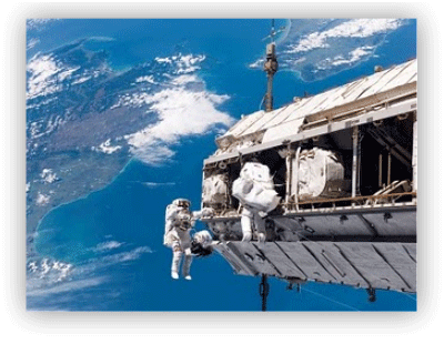
How to Add Drop Shadows Effect to Images
With drop shadows effect to images, our blog images will given a kind of shadow which will surround beside the images. So, the images will look attractive. This effect is active when you put your cursor on the picture, then the picture will expand and there are drop shadows effect. For additional info, drop shadows effect is used CSS (CSS 3), so your blog is not too heavy. Now, if you want to know how to add drop shadows effect to images, just follow the steps below.
1. Log in to your blogger account
2. Go to Design --> Edit HTML
3. Copy the code below, and paste above ]]>
5. Done!
1. Log in to your blogger account
2. Go to Design --> Edit HTML
3. Copy the code below, and paste above ]]>
.MBT-CSS3 img{
-webkit-transform:scale(0.7); /*Webkit 0.7 times the original Image size*/
-moz-transform:scale(0.7); /*Mozilla 0.7 times the original Image size*/
-o-transform:scale(0.7); /*Opera 0.7 times the original Image size*/
-webkit-transition-duration: 0.5s; /*Webkit: Animation duration*/
-moz-transition-duration: 0.5s; /*Mozilla Animation duration*/
-o-transition-duration: 0.5s; /*Opera Animation duration*/
opacity: 0.5;
margin: 0 10px 5px 0;
}
.MBT-CSS3 img:hover{
-webkit-transform:scale(1.1); /*Webkit: 0.5 times the original Image size*/
-moz-transform:scale(1.1); /*Mozilla 0.5 times the original Image size*/
-o-transform:scale(1.1); /*Opera 0.5 times the original Image size*/
box-shadow:0px 0px 30px gray;
-webkit-box-shadow:0px 0px 30px gray;
-moz-box-shadow:0px 0px 30px gray;
opacity: 1;
}
4. Then, when you will use drop shadow effects to images, use this code
=> Change IMAGE URL with your image URL choiceIMAGE URL" />
5. Done!

