Design Your Stylish Timeline Portfolio In 30 Steps

In this tutorial I’ll be using Photoshop CS6 to design a simple, clean, three-columnportfolio page, with a trending timeline. During this process we’ll look at creating custom grids with guidelines, styling typography, and playing with colors and contrast to achieve the aesthetics we want. The finished PSD file will be ready to hand over to a developer for coding up.
Tutorial Assets
In order to follow along you will need the following (freely available) assets:
- Raindrops photo from Unsplash
- NYC skyline photo from Unsplash
- Notebook PSD Template from Dribbble
- Free Vector Icons from Chapps
- Lato font from Font Squirrel
- Avatar from User Inter Faces
- Dribbble icon from Iconfinder
- Twitter icon from Iconfinder
- Facebook icon from Iconfinder
- Google+ icon from Iconfinder
Get the Document Ready
Step 1
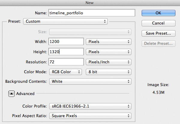
Begin by creating a new document (File > New…) using the settings shown below.
Step 2
Let’s set some guides so our layout has enough space and looks balanced. Go to View > New Guide… and set the following guidelines: vertical at 20px, 50px, 115px, 230px, 550px, 570px, 875px and 1180px, and horizontal at 60px.
Tip: You could also use the GuideGuide Photoshop plugin to make this process evenquicker.

Step 3
We’re going to keep our document well-organized from the very beginning, so let’screate three layer groups named
Left Sidebar, Descriptions and Work. Sticking to this Photoshop etiquette will keep things organized and easy to navigate or edit. To create groups go to Layer > New > Group… and give each one a title as mentioned. For quick creation of a group just click the icon.
Designing Left Sidebar Area
The sidebar on the left will serve as an area for a user profile, avatar, social links and primary navigation. Let's build it!
Step 1
Select the Rectangle Tool (T), change the foreground color to
#11171c and draw a 230x1320px rectangle inside the Left Sidebar group. It should be placed on the left of the document between the edge of the document and the fourth vertical guideline.
Step 2
Create a new group above the previously created rectangle shape and name it
Profile Pic. After that, pick the Ellipse Tool (U) and, holding down the Shiftbutton, draw a 100x100px circle and place it right below the first horizontal guideline. It should be centered with the third vertical guideline too.
Step 3
Now head over to uifaces.com and grab one of the avatars available. Alternatively, simply find your own photo and paste it above the recently created circle shape. After that, hold down the Alt key and mouse over the thumbnail of the photo layer until you see a little down arrow. When you see it, release the button and it will create a
Clipping Mask, binding your photo to a circular form. Align it however you see fit, using the Move Tool (V).
Step 4
Now minimize the
Profile Pic group by clicking that little arrow next to the group title. After that, change the foreground color to #FFFFFF and pick the Horizontal Type Tool (T). Select the Lato (Regular) font, set size to 16pt and write the name of our portfolio owner. In my case it is the completely fictitious Chris Johnson. Place it 25px below the profile picture and make sure it is centered with the third vertical guideline.
Step 5
Now we need a short description for our portfolio so visitors instantly get a sense of what it's all about. We'll use the same tool; all we need to do is decrease the font size to14pt and write a brief couple of lines about the portfolio owner. To make it look organized and balanced place it 20px lower so it has some space to breath.

Step 6
Good. Now let's place some social media icons making it easy to connect with the portfolio owner. Create a new group with a following title:
Social Media. After that, head over to Iconfinder to download Dribbble, Twitter, Facebook and Google+ icons as PNG. Drag them to your Photoshop document and place them inside the Social Media group. Now right-click the Dribbble icon, select Blending Options.. and apply the Color Overlay option. Instead of the default red, set the color to white.
Step 7
All other icons should be white too, so let's apply the same layer style to the rest of the icons. Simply right-click the
Dribbble icon layer and select Copy Layer Style. After that, hold down the CMD key and select the Twitter, Facebook and Google+ layers. Again right-click one of them and select Paste Layer Style. Finally, align the icons so there is a 10px gap on each side and the group is placed 20px below the description text.Step 8
Let's change the foreground color to white
#FFFFFF, then pick the Line Tool (U), setweight to 1px and, holding down the Shift key, draw a horizontal line from the left document edge to the fourth vertical guideline. Move it 50px from the icons.
Step 9
To make our line more visually subtle, let's reduce the line layer's Opacity to 10%.

Step 10
Let's now concentrate on our navigation, so create a new group called
Navigationand place it above the dark rectangle layer. After that, pick a document icon from the Free Vector Icons from Chapps icon set and drag it to your portfolio document. HitCMD+T to resize the icon to 13x16px. After that, double-click the layer name and rename it to Work icon. With that done, double-click a layer thumbnail and change the color to #d35136. Place the icon 40px below the subtle line and 20px from the left edge, so it aligns with the first vertical guideline.Step 11
Now for some navigation items. Pick the Horizontal Type Tool (T), choose the Lato (Bold) font, set size to 14pt and write the following:
WORK. Place that in front of the second horizontal guideline and make sure it aligns vertically with the Work icon.
Step 12
Change foreground color to
#424a51 and, using the same text tool, write down some categories to go under work, each one starting on a new line. Make sure that the line height is set to 24pt so our categories are easily readable. Place the categories layer20px below the previously created text layer.
Step 13
We need to indicate the active state of the link. For the active category use white
#FFFFFF, simply click on the text while Horizontal Type Tool (T) is still selected, highlight the first category and change the color.
Step 14
Now pick a user icon from the previously used icon set and resize it to
16x16px usingCMD+T. Click twice on the icon layer thumbnail and change the color to #27b599, rename the layer to User icon so it is easier to manage our layers. Place it 30pxbelow the last category to give it some negative space which will act as a separator.Step 15
Change the foreground color to green
#27b599 as used for the User icon and pick the Horizontal Type Tool (T). Select the Lato (Bold) font, set the size to 14pt and write ABOUT. Place this label right after the user icon, as you did for the section above. Then change the foreground color to #424a51 and enter some link titles for the "about" section.
Step 16
Let's now create the last section on our navigation; Contact. Pick the mail icon from
Free Vector Icons from Chapps and resize it to 16x13px, after that change its color to #088ecc and place it consistently as the icons before, 30px below the last text layer of the About section. Having entered the CONTACT text, change the foreground color to #424a51 and write down some link titles for the section.
Designing Descriptions Area
Shifting one block over to the right, let's now get started with our portfolio items' descriptions.
Step 1
We'll minimize the currently used
Navigation and Left Sidebar groups by clicking on the little arrows next to the group names. Expand the Descriptions group, change the foreground color to #f7f7f7 and select the Rectangle Tool (T). After that, draw a vertical rectangle shape between the edge of Left Sidebar and the fifth vertical guideline. This rectangle should be 320x1320px.
Step 2
Now change the foreground color to
#e7e7e8 and pick the Line Tool (U). Set the Weight to 1px and, holding down the Shift key, draw a vertical line from top to bottom on the fifth vertical guideline. This should create a better visual separation between theDescriptions group section background and the main background. Hit CMD+; to hide/unhide guidelines. Lastly, rename the line layer to V line so it makes sense later.
Step 3
We're going to draw another vertical line, so change the line Weight to 3px and draw another line across the document (holding down the Shift key to maintain perfect verticality). Click twice on the layer name to rename it to
Timeline. After that, move the line 24px right from the Left Sidebar edge and 30px down from the top of the document.
Step 4
Change the foreground color to our previously used red
#d35136 and pick the Ellipse Tool (U). After that, hold down the Shift key and draw a 11x11px circle. Place it 20px to the right from the edge of the Left Sidebar area and 20px down from the top of the document. Our little circle should be nicely placed on the top of the recently created line.
Step 5
Now right-click the recently created circle layer and select Blending Options... . Click on Stroke. Set Size to 3px, Position to Outside and color to
#f7f7f7. This background-color stroke will create the effect of our circle floating next to a line.

Step 6
Change the foreground color to
#11171c and pick the Horizontal Type Tool (T). As ususal, choose the Lato (Bold) font, set the size to 14pt and enter a date for the work e.g. "7 Nov 2013". Then, using the Move Tool (V), move the date layer 20px to the right of the red circle and 20px down from the top of the document.You should, by now, have noticed a pattern in our spacing. It is important to be consistent and use rhythmic spacing for different elements so the design looks balanced.

Step 7
Change the foreground color to
#5e5e5e so it is slightly lighter than then date. This creates a visual hierarchy, making reading much easier. Use the same Horizontal Type Tool (T), Lato font, but this time change the font weight to Regular and enter a few lines for a brief work description. Then, make one line break by hitting the Enterbutton twice, and enter the client and tags for the work e.g.:- Client: Despreneur
- Tags: Web Design
Highlight "client" and "tags" and set the font weight to Bold, so they will differ from the description and will be perceived as links. Lastly, ensure that the line height is set to 18pt so our lines have enough space to breath.

Step 8
To duplicate the features we've just made, select the red circle, date and description layer. Then hit CMD+J, or right-click and select Duplicate Layers..., hitting OKthereafter. Move the duplicated contents a couple of hundred pixels below the original. We'll adjust the position of this later, as it will be dependent of the work image height we'll place next to it.

Designing Work Area
The final vertical section of our layout is for the portfolio pieces themselves. Let's build it!
Step 1
We'll begin (as usual) by minimizing the currently used
Descriptions group and opening up the Work group. Pick the Rectangle Tool (U) and draw a 610x400px sized rectangle between the sixth and eighth vertical guidelines (color doesn't matter this time, just make sure it is visible). Place it 20px below the top of the document so it has 20px of space all around.
Step 2
Now pick an image of your work, I'll use the Notebook PSD Template screenshot I designed earlier. Drag it to your Photoshop document window, and make sure it is placed above the previously created rectangle shape layer. Holding down ALT key, mouse over the screenshot layer name until you see a little arrow down. When you see it, release they key and it will create a Clipping Mask so your image will only be visible within the area of the rectangle. Finally, hit CMD+T and resize the image as you like it to be.

Step 3
Select the rectangle shape layer, duplicate it, and move it 20px below the first image. Add another image of your work as we did with one before. For the second work example I've used Raindrops photo from unsplash.com. After that, create a third piece of work and place it 20px below the second one. For the third work image I've used theNYC Skyline photo, again form unsplash.com.

Step 4
We now need to go back and make sure everything is lined up properly. Open up the
Descriptions group again and find the red circle, date and description layers. Select them all holding CMD key and move them down until they align with the top of the second portfolio image. Duplicate these layers by clicking CMD+J, or right-clicking the layers and selecting Duplicate Layers.... After that, place them next to the third work image and align with the top of that image.
Step 5
Awesome. We're close to the end. Minimize the
Descriptions group and open upWork group again. After that, pick the refresh icon from the icon set and drag it to your portfolio document. Hit CMD+T and resize it to 20x20px. Click twice on the icon layer thumbnail and change the color to #a0a2a4. Finally place it 20px below the work image.Step 6
Last step! Let's create a dynamic element which will show up when our website is scrolled down and the server is loading up more work. Pick the Horizontal Type Tool (T), choose 14pt size Lato (Bold) font and enter the text
Loading.... Place it next to the refresh icon and move it 10px to the right. After that, select both layers, icon and text and place them in the center of the vertical guideline of the work image.
You’re Done!
So there you have it. We walked through the creation of a portfolio website layout, from scratch, in an organized and efficient manner. The file we built is ready to hand over to a developer who can pull it apart, find all the elements needed, and build for the browser.
I hope you learned something new by following this tutorial. If you have any questions, or have difficulties please don’t hesitate to ping me in the comments section or via Twitter.