Review: Apple Watch Series 4
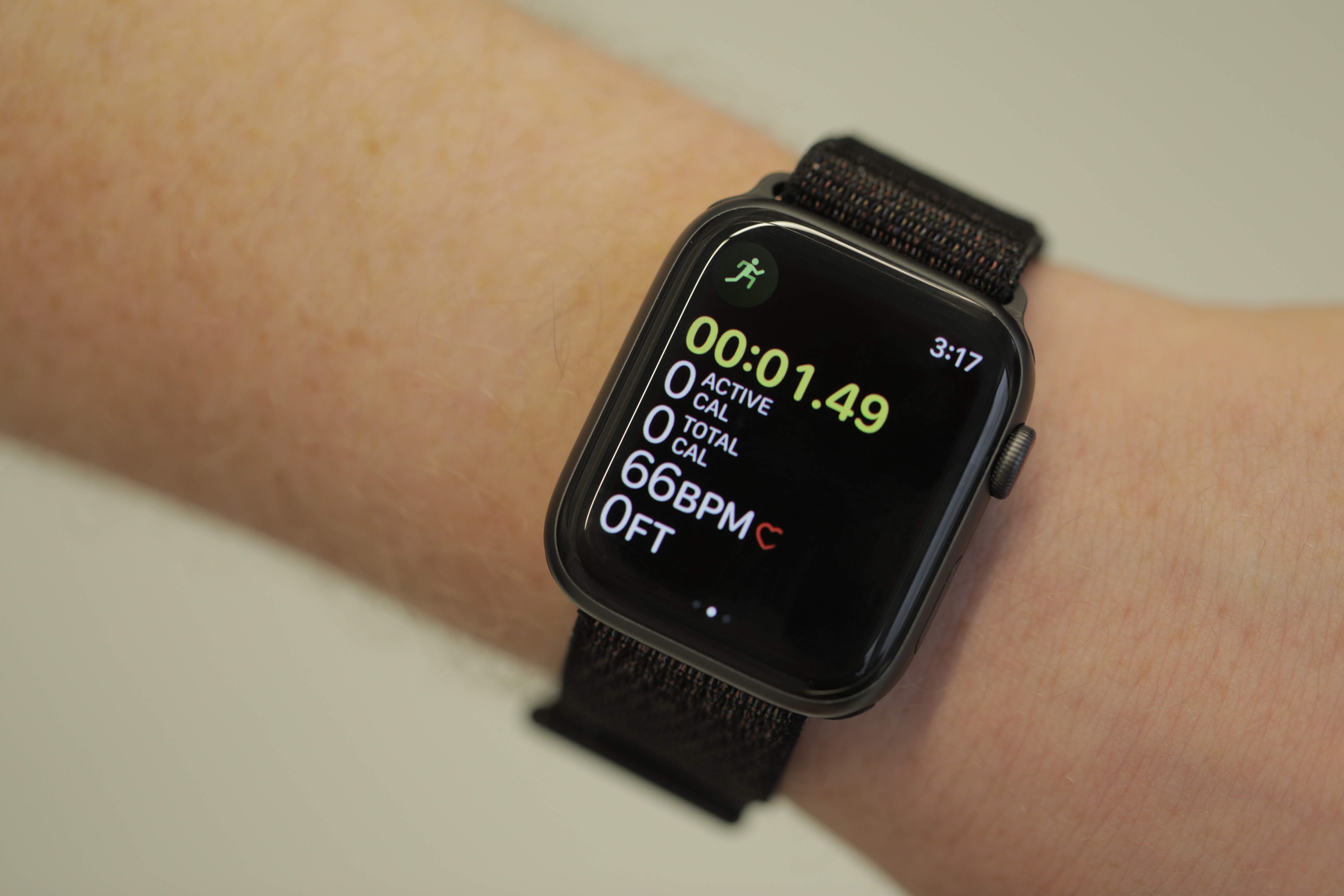
Roughly two-and-half minutes into my run, the watch kicks in. There’s a haptic buzz on my wrist.
“It looks like you’re working out,” the watch face reads. That’s followed by a big, yellow button, suggesting I start an indoor run. I tap the neon button and the clock starts, comping me a reasonable approximation of the time it took for the Watch to be sure what sort of activity it was detecting.
I wasn’t actually planning to test the feature on this particular run. In all the stretching/music picking/treadmill setting pre-run ritual, I’d just forgotten to set the damn thing. It feels like a small thing, but, then, most of the updates are relatively small in the grand scheme of things. In the case of the Apple Watch, radically departure would almost certainly be a bad thing.
You see, there are smartwatches and then there’s the Apple Watch. That’s not so much a tacit endorsement of the product, so much as an objective analysis of the numbers. Numbers from IDC earlier this year show Apple leading all wearables on the strength of its single smartwatch.
In fact, the company accounted for more than half of smartwatch shipments last year. Simply put, the Apple Watch has long represented a rare bright spot in a flagging wearables category. The device has been successful enough for long enough that analysts are once again bullish on the category going forward. That’s an impressive feat by any measure.
So what’s a market-dominating smartwatch maker to do? For Apple, the answer is two-fold. First, improve upon the overall experience without altering anything too much. With the Apple Watch Series 4, that means subtle hardware improvements like a larger screen while maintaining a similar form factor, as well as tweaks like the addition of haptic feedback to the Watch’s crown.
After all, Apple’s success doesn’t lie in any single standout feature. Rather, as with the iPhone, the company has excelled in providing an overall hardware and software experience that makes it possible to use the product mostly without thinking — as evidenced by the above workout feature.
Second, show the world precisely how committed you are to health. Even with the existence of cheaper fitness trackers, health and fitness have long been understood to be the primary drivers in smartwatch sales. For Fitbit, that means pivoting much of the company toward health care.
For Apple, it’s finding ways to have the Watch taken more seriously as a health-monitoring device. While it’s true that the product won’t be replacing medical products any time soon, the wearable has the decided advantage of constant monitoring.
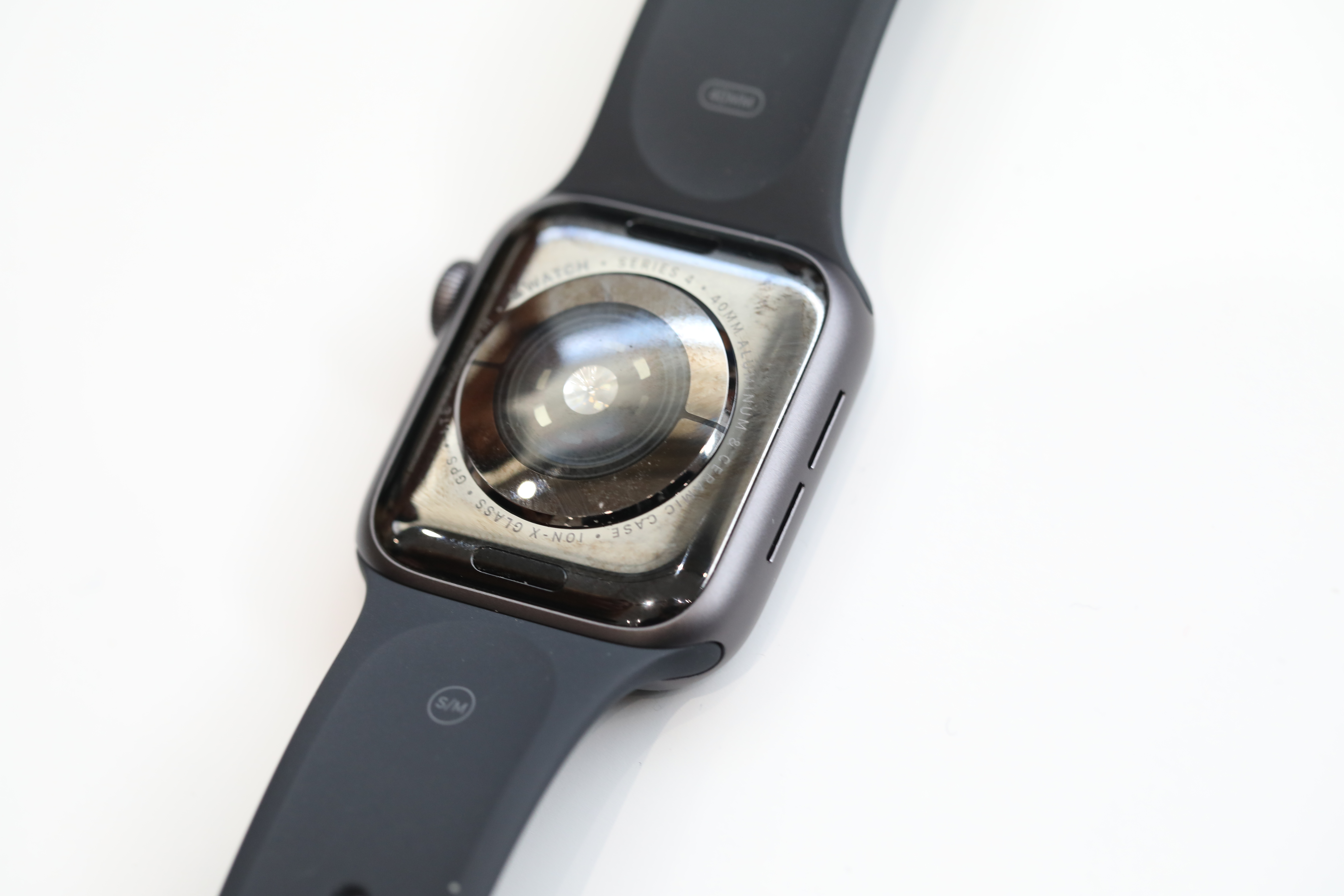
That means, unlike hospital equipment and other pricier technology, it can be worn as a kind of safeguard. New features like the ECG (electrocardiogram) monitor on the rear of the device and automatic fall detection aren’t aimed at replacing doctor checkups. They’re safeguards for those times when users aren’t in a doctor’s care.
Analysts have bet much of the category’s future growth on Apple’s ability to identify and target new markets. Having cornered techies and a younger demographic, older users and those with health problems present a clear way to expand the Watch’s existing base.
Day to day
I wear a lot of smartwatches. It’s a byproduct/perk of the job. Between reviews, however, I always come back to the Apple Watch. For one thing, while I switch back and forth between Android and iOS handsets, my primary phone is an iPhone. One of Apple’s biggest appeals has been its ecosystem. The products just work well with one another to a fault — and once you’re locked in, it’s hard to get out.
That’s not the sole reason, of course. Google, Samsung and Fitbit all have iOS apps now. And while integration isn’t perfect, it’s certainly usable. The fact is that the Apple Watch is an elegant solution from both a hardware and software standpoint. It walks the key wearable line of being engaging when necessary and fading into the background the rest of the time.
Contrary to early reports (and speculation over that event invite), Apple stuck with the squircle (it’s a real geometry term, look it up) this time out. The design was a bit polarizing early on, but I suspect most users have since come to appreciate the things it affords, including the ability to fit more text on the screen.
The face of it

Of course, that’s doubly the case here. The clearest difference on the hardware side of the increased display size, which, like the iPhone X, Apple managed to increase the screen without making much of a dent in the overall footprint.
The Series 4’s case is slightly larger and wider than its predecessor, but it’s not really noticeable unless you happen to have two side-by-side. Even with the slightly larger surface area, the Apple Watch remains one of the more wearable wearables.

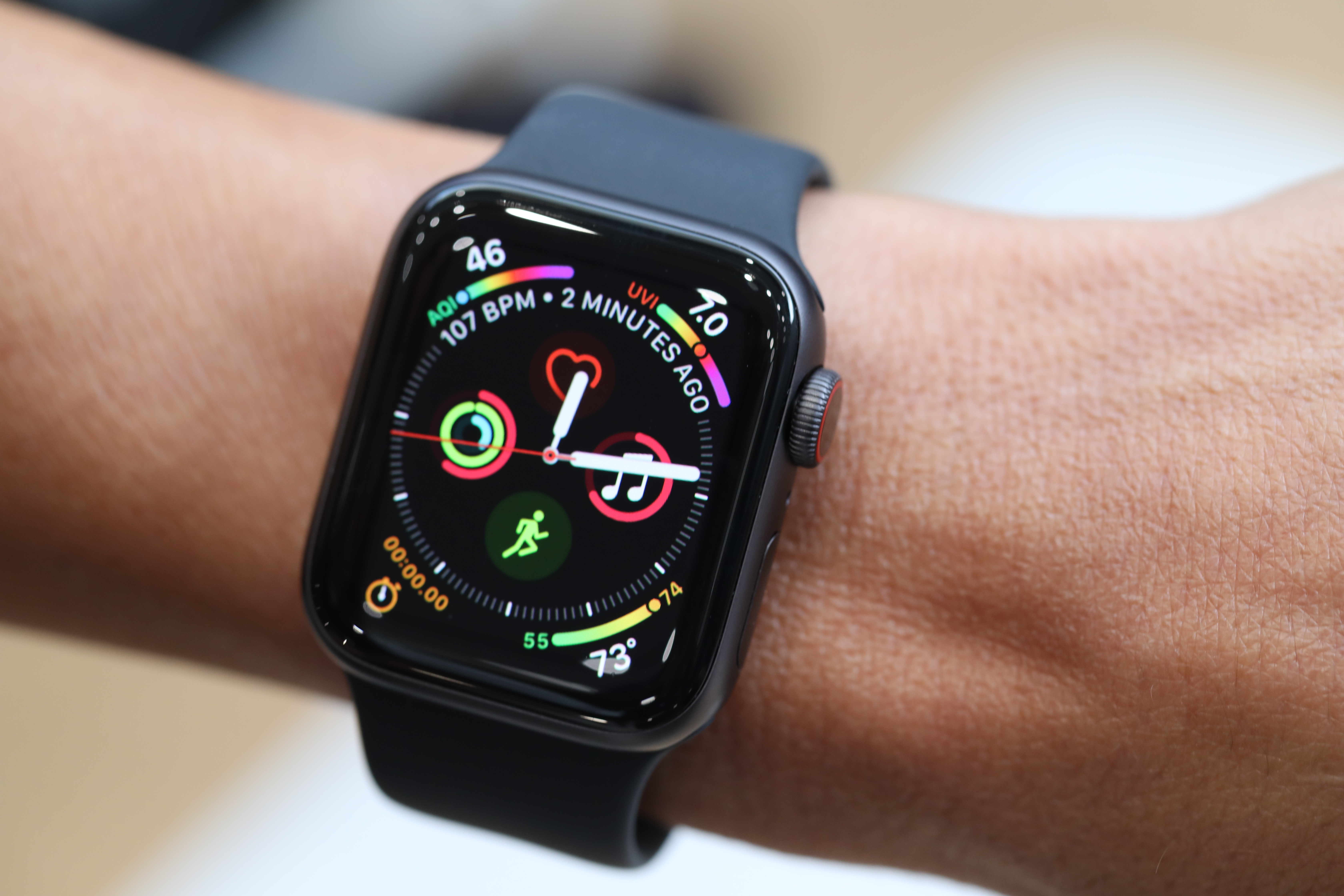
If you’ve used an earlier version with any regularity, on the other other hand, the increase in surface area is pretty readily apparent, especially when an email notification comes through. It also means app developers can jam in more detail and the Watch’s faces can feature additional complications (a descriptor I suspect makes Apple designers die inside a bit every time they have to utter it).
With the 30 percent larger display, you can add things like the Breathe app to the face for easy access. It’s a rare instance of the company pushing to bring more detail to a surface, but with the limited real estate afforded by a smartwatch screen, you take every precious millimeter you can get. The fact that the bezels are smaller also means app designers don’t have to lean as heavily on black backgrounds to help mask the unused space.
On the case
Apple also managed to make the new watch thinner than its predecessors. The benefit there is obvious when it comes to making a product designed to be worn on the body. And the slightly larger case size means Apple was able to accomplish this without having an impact on battery life.
It’s an interesting choice, given that much of the competition has zeroed in on battery life with recent upgrades, including, notably, the new Galaxy Watch, which Samsung rates at “several days.” With good reason — battery has long been one of the biggest issues with smartwatches.
As with earlier versions, Apple rates the Series 4’s battery at “all day,” which certainly lines up with my own testing. Even so, I would happily trade a millimeter or two of thickness for some additional mAhs. As it stands, you should be able to get through a day’s use without worrying about finding a charger, but the peace of mind of more battery life is always welcome.
I admit I didn’t think much of the digital crown when Apple mentioned it on stage. If anything, it sounded like a sort of parlor trick. When I finally had a chance to try the device on at the event the other week, however, I was surprised at how much I dug it.
Spinning the circle really feels like turning a mechanical dial. And when there’s nothing on screen to move by spinning it, the feedback simply shuts off. Again, it’s a small touch, but a nice one, nonetheless. This is still probably the one spot where Samsung really has a leg up on Apple. The Galaxy (nee Gear)’s spinning bezel is still my favorite method for interacting with smartwatch menus (and the top reason to consider a Samsung model). Though the new digital crown is a fairly close second place.
For your health
Apple devoted a good amount of the Apple Watch’s stage time to health and wellness. And understandably so. The company firmly believes that the product’s capabilities as a health monitor are the way forward for the Apple Watch. Added sophisticated tools like the ECG also go a long way toward the company continuing to position the wearable as a premium product.
After all, budget devices from companies like Xiaomi represent the other key growth area in the fitness space. Apple has also seen a surprisingly successful competitor in the form of the $200 Fitbit Versa. Sure, the company got off to a rocky start, but its latest Pebble-esque smartwatch looks to be a bonafide hit. And it’s a pretty solid solution for those looking for a low-cost or Android-friendly solution.
ECG is an interesting addition, because for most users, it’s not an everyday feature. It’s a great addition for older users and those with existing conditions. Information collected day to day can be shared with doctors via the Apple Health app. For the rest of us, the product has the potential to flag irregularities and things like atrial fibrillation.
No one is suggesting an FDA-approved feature can or should replace a doctor, but if it helps shed some light on heart issues, that’s certainly a net positive. And that’s really where the Apple Watch thrives as a health care device — it offers potential insight into larger issues. That includes the addition of things like low heart rate notifications in watchOS 5 (which joins the high heart rate notifications from its predecessor) and the irregular rhythm notifications that arrive via the ECG.
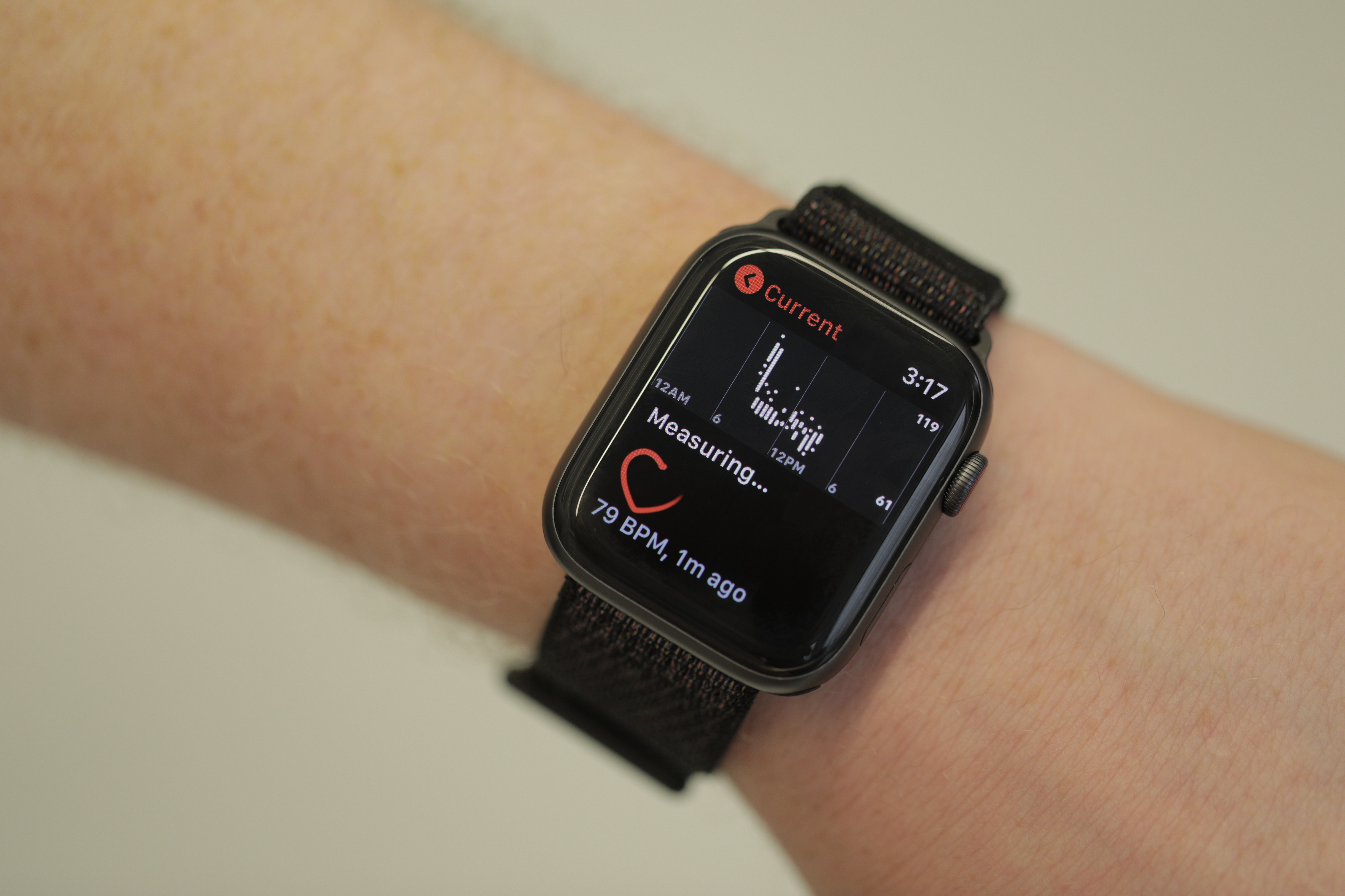
The feature won’t be available until later this year, so I wasn’t able to test the thing. And when it does arrive, it will only be available in the U.S., likely due to the intricacies of different health regulatory bodies from country to country. When it does arrive, it will work as follows, per Apple: “Simply touch the Digital Crown to generate an ECG waveform in just 30 seconds. This data can indicate whether your heart rhythm shows signs of atrial fibrillation — a serious form of irregular heart rhythm — or sinus rhythm, which means your heart is beating in a normal pattern.”
That means the crown is essentially doing double duty, serving as one of two electrodes (the other is on the rear of the watch) for measuring heart rhythms. It’s a pretty novel addition to an existing feature.
Fall detection is the other feature I’ll readily admit I wasn’t able to properly test this time out. The feature is automatically enabled for users aged 65 and over. Everyone else will have to manually enable it via the iPhone app under the Emergency SOS setting. When it detects a fall, an Emergency SOS screen will pop up — not dissimilar to those Life Alert devices from the 80s. If the wearer is unresponsive for a minute, it will send out the alert.
I can, however, attest to the fact that I didn’t register any false alerts while wearing the device. Slamming your hands on the desk or collapsing into your bed won’t set it off. Apparently stunt people and others trained at falling won’t be able to set it off, either. I tried taking a few controlled spills into my rabbit’s floor pads, with no results beyond sore hands and a confused bunny. Don’t try this at home, kids.
Watch this space
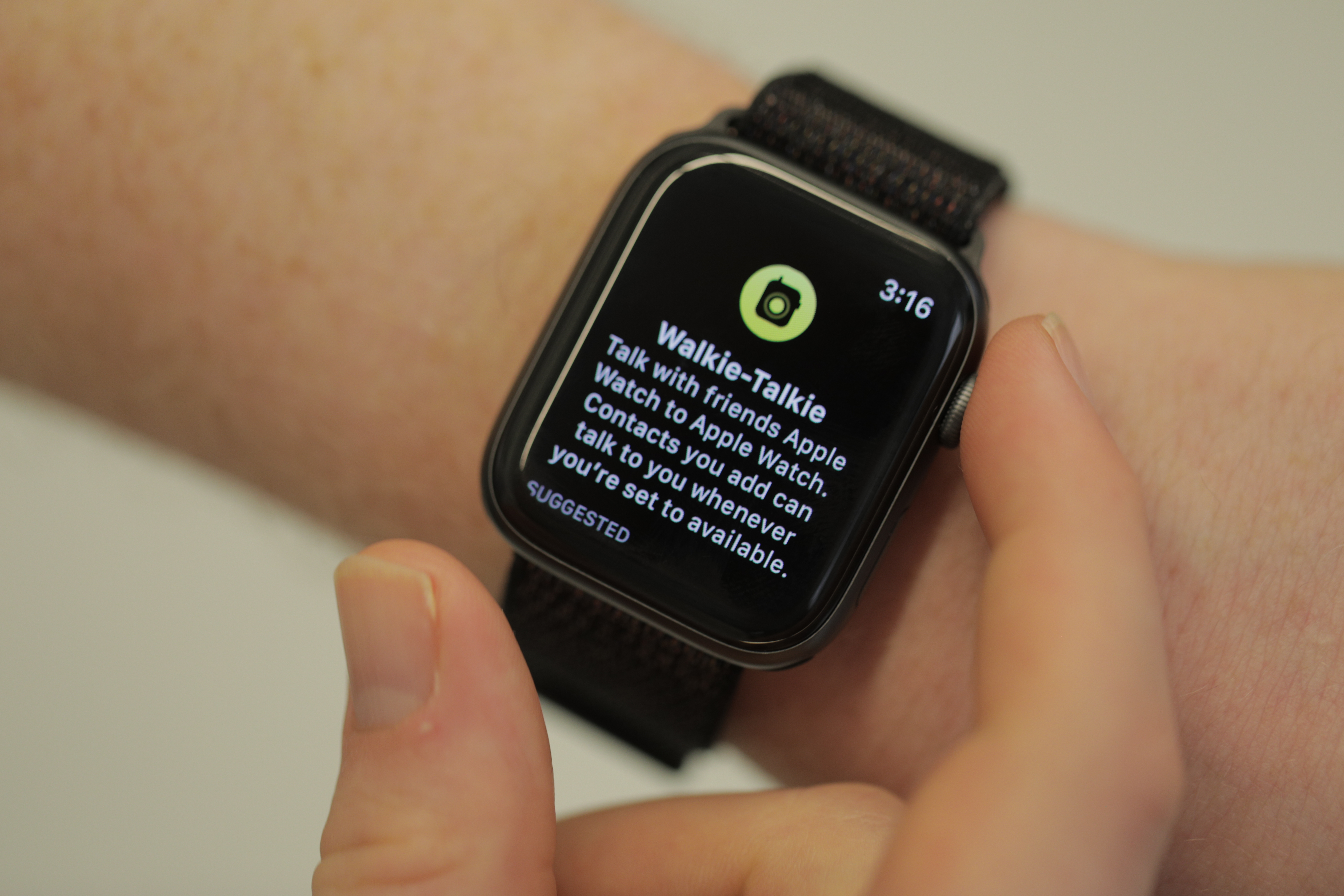
There are other fun features scattered throughout. Walkie Talkie is a cool one. It’s more of a fun novelty than an indispensable addition. It’s a quick and easy way to communicate with fellow Apple Watch owners over Wi-Fi or cellular, sending through transmissions with the push of a button. It’s also a good way to take advantage of 50 percent louder speakers.
The Series 4 isn’t the kind of refresh that justifies upgrading from the last generation, especially given the $399 and $499 starting prices for the standard and LTE models, respectively. But there’s certainly enough here to keep the Apple Watch at the top of the smartwatch heap. The addition of serious health features like ECG and fall detection further lay the groundwork for a what the device — and category — will become, going forward.
