Here's a Glimpse at What OxygenOS 10 Based on Android Q May Look Like
[the_ad id='1307']

OnePlus is looking to implement a massive redesign of its OxygenOS ROM, and as always, has been seeking inputs from users and fans around the world. As part of its plans to make the community feel more involved every step of the way, the company recently held a contest to select an honorary Product Manager with a view towards possibly including some of their ideas in the redesigned software.
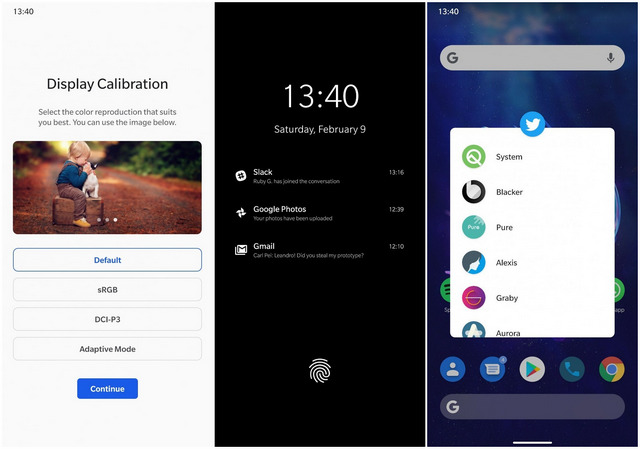
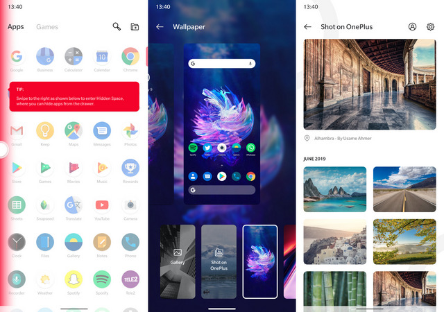
The winner was a UX designer called Léandro Tijink, who now says that he had the opportunity to present some of his ideas to the OnePlus design team in Shenzhen. He has now posted a series of mock-up screenshots, revealing some of the design changes he suggested at the meeting. While all features and UI elements suggested by Tijink may not make their way to future versions of OxygenOS for a variety of reasons, they do reveal the passion, hard work and thought that he put behind his presentation.
There are literally dozens more screenshots that show how OxygenOS can be improved with some changes to its UI and added functionalities, with Tijink suggesting several major and minor tweaks over the current official ROM. According to him, the attention to detail with the new features will bring more consistency and ‘buttery smooth animations’ to OxygenOS. He actually created a whole new website to post all his images, and you can check them all out by clicking here.
As can be seen from the screenshots, a whole lot of changes have been suggested to various aspects of the operating system, right from the initial setup process to the launcher, and from the Settings menu to the default Gallery app. With OxygenOS 10 slated to arrive later this year with the OnePlus 7T, it will be interesting to see how many of the proposed changes will be implemented by the company.
[the_ad id='1307']
Source link
[the_ad id='1307']