Colorful Icons Are Coming to Windows 10
[the_ad id='1307']

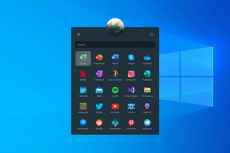
As an attempt to embrace the Fluent Design System, Microsoft is testing new colorful icons for its system apps, according to a leaked insider build.
The redesigned icons were spotted first by people at Aggiornamenti Lumia, an Italian tech blog. According to them, these new icons were leaked “by mistake” from Microsoft servers in Insider build 18947.
The apps getting redesigned icons include the Camera app, Calendar, Microsoft Solitaire, Weather, Groove Music, Movies & TV, Microsoft Forms, and the beloved File Explorer, all of which are designed in Fluent Design standards and constraints.
Take a look at the gallery below to see the redesigned icons leaked by Aggiornamenti Lumia.
As you can see, these icons look more vibrant and have a more lively feel and appearance when compared to the existing outdated icons.
As of now, a clear timeline is not known regarding the official rollout of these new icons but we can expect the same to happen with the next major release of Windows 10 (20H1) which is expected to happen later this year.
There are also rumors suggesting that these redesigned icons would be making their way to the upcoming Windows 10 Lite. We’ll have to wait to witness how that turns out in the following months.
Since these leaked icons are from an early insider build, certain changes in the design should be expected in the upcoming builds as Microsoft continues to fine-tune the icons to suit the design aesthetics of the operating system.
I personally like these new icons better, especially in apps like Groove Music and Movies & TV where a neat gradient has been implemented in the logo. So, what do you think of these new icons? Will you rather use the older ones? Let us know in the comments.
[the_ad id='1307']
Source link
[the_ad id='1307']