Microsoft 'To Do' App Gets New Features Ahead of Expected Wunderlist Shutdown
[the_ad id='1307']

Microsoft on Monday announced a slew of changes to its To Do productivity app, incorporating many new features from the popular Wunderlist app that the company acquired back in 2015 as part of its long-standing plans to pull down the curtains on the older app, something the company had announced back in 2017.
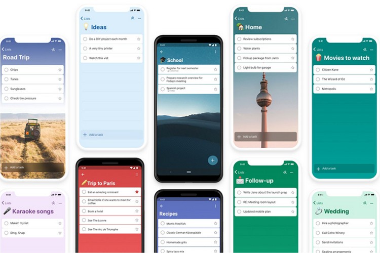
The update brings a fresh new design to the app, as well as enhanced integration with Microsoft apps and services. According to a Microsoft blog post, the app now offers more options to customize, starting with a wide range of backgrounds, including the beloved Berlin TV tower that was a feature in Wunderlist. In addition, users will now also be able to choose a different background for every list, said the company.
Other notable UI changes include a reduced header size and a flourish of new colors to give the app a vibrant new look. It now also has a Dark Mode on Android, Windows and Mac, and it will soon come to iOS as well.
Another Wunderlist feature imported into To Do is ‘Smart Lists’ that allows users to see their planned or important tasks in one list. According to Microsoft, it’s part of the personalized daily planner feature, My Day, which comes with so-called ‘Smart Suggestions’ that help users “accomplish what’s meaningful and important to you every day”. According to Microsoft: “My Day will refresh (everyday), so you can start the day with a blank slate. Any tasks you didn’t complete will be waiting for you in suggestions”.
To Do offers cross-platform syncing between Mac, iOS, Android, Windows and the web, enabling users to easily access their lists on the go. On Windows and Android, users can also toggle between work and personal accounts, said the company. It is also integrated into other Microsoft apps and services, such as Hotmail, Office (Outlook, Live etc.), Cortana and even Microsoft Launcher on Android.
[the_ad id='1307']
Source link
[the_ad id='1307']
