Chrome Canary on Android Testing Redesigned Tab Switcher
[the_ad id='1307']

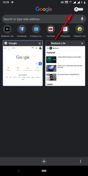
The Canary channel of Google Chrome on Android is rolling out a redesigned tab switcher page as part of the company’s continuous endeavor to bring a more intuitive UI to the app. As part of its plan, Chrome is adding a toggle to switch between regular and incognito tabs, which continue to be represented by small rectangular cards, each of which can be closed by either swiping or via the small ‘cross’ button on their top-right corner.
One of the biggest benefits of the new layout is that it enables users to switch over from incognito tabs to general tabs via a simple toggle at the top of the tab management page, as can be seen from the screenshot below. The new feature is enabled by default, so there’s no need to change any setting via chrome://flags.

Another new addition is the row of icons depicting the most-visited sites. It sits just above the regular tab cards and just under the Google search bar. While the overall design does feel more intuitive, the additional elements make the UI feel somewhat cramped, given the lack of screen real estate on standard smartphones. Another feature Google might want to add going forward is an indicator showing the number of incognito tabs in the background.
Overall, the new additions have just been rolled out to Chrome Canary, which means it might be a while before it’s rolled out to the stable channel, so it will be interesting to see how this UI will evolve in the intervening period.
[the_ad id='1307']
Source link
[the_ad id='1307']