LG Unveils Its New User Interface "LG UX 9.0"
[the_ad id='1307']

LG has recently unveiled a refreshed user interface for its phones called “LG UX 9.0” and it looks very similar to Samsung’s OneUI; that’s not exactly a bad thing since OneUI is a pretty great UI to have on a smartphone.
In a video uploaded by LG to YouTube showing off the major changes in the new user interface, the similarities between this UI and OneUI are striking. The company has made text stand-out better, with heavier font-faces. The Messages app now shows more of the conversation without opening the messages themselves, the Contacts app now has bigger spaces between contacts, and clear letter-markings.
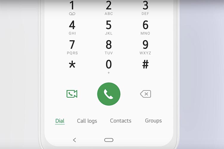
The new UI also moves major functionality to the lower part of the screen to make it easier to access single-handedly without having to make too much effort. This can be seen with the company moving menu items such as search, dial, call logs, and others to the bottom of the screen.
The Gallery app is also redesigned with a more streamlined design, and albums also look better organised, although this design also looks very similar to the gallery design in OneUI.
The electronics company hasn’t said anything about which phones will get this new redesigned LG UX 9.0 or when, but the company mentioned in the video description that the new UI is optimised for the LG G8X ThinQ, so it seems to a safe bet that at least that phone should be getting it.
[the_ad id='1307']
Source link
[the_ad id='1307']
