New Microsoft Edge Logo Tries to Ditch the Internet Explorer Legacy
[the_ad id='1307']

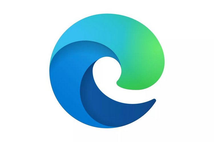
With the new Chromium-based Edge, Microsoft is trying to get as far away from the chequered legacy of Internet Explorer as possible. After ditching the EdgeHTML engine in favor of Chromium following a less-than-impressive uptake, the Edge browser is now set to get an all-new logo that looks visually similar to the iconic Firefox symbol than its own spiritual predecessor, the IE. The design, however, still retains its blue hue, albeit, with a bit of green added to the mix.
As can be seen from the featured image, the new logo still looks like an ‘e’, but is more in line with the company’s so-called ‘Fluent’ design language that was used to create new logos for all of the Microsoft Office components earlier this year. As for the new Edge logo, it was originally discovered as part of a new surfing mini game hidden inside the latest Canary versions of Edge before being unveiled over the weekend by senior Microsoft executive, Vishnu Nath.
How do you like our new #Edge logo?? #comingsoon! pic.twitter.com/EgL6n5xqRI
— Vishnu Nath ⌨️ (@VishnuNath) November 2, 2019
In case you don’t know it already, Microsoft is deprecating its older Edge browser, which was originally released for Windows 10 in 2015, before being rolled out on Android, iOS and just recently, on macOS. However, with the horror stories about Internet Explorer still fresh in everyone’s minds, the browser never quite got the reception that Microsoft would have hoped for, in spite of bringing several improvements over its predecessor.
After testing preview builds (Canary and Developer channels) for the Chromium-based Edge browser over the past several months, the Redmond giant, back in August, launched the first open beta of the new software. It’s available for Windows and macOS, so you can check it out right away.
[the_ad id='1307']
Source link
[the_ad id='1307']