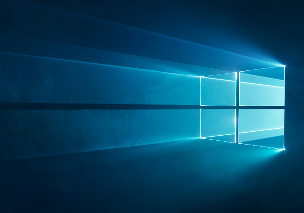
Windows 10 Desktop: Physically building and photographing the logos (2015)

An icon is defined, among other things, by its longevity. Icons don’t withstand change - they endure it, by
evolving with the times.An icon adapts to each new era, maintaining its identity while simultaneously remaining contemporary and fresh. At their best, icons provide both a connection to our past, and a window into our future.
For almost 30 years,
Windowshas been an icon among icons, creating portals into new worlds by providing users with an entirely customizable experience that progresses as fast as they do.
Windows is used by over a billion people each day, from air traffic controllers to NASDAQ traders to obstetricians. Which is why the
Windows Hero Desktop Imageis easily one of the most widely recognized images in the world. It’s the first thing users see when they begin their Windows experience, and it’s featured in every Windows ad that’s shown in nearly every country in the world.
In 2015, Windows evolved yet again with the release of
Windows 10- the final major release of Windows before it moved to quick-turn digital updates. To mark this evolution, we had the pleasure and honor of creating the Windows desktop as an icon - the kind people can shape as part of their own world.
When I first looked at the Windows logo, I saw more than four tiled squares. I saw the space behind it, and the energy that shines through and gives it a sense of propulsion. The logo makes an impression with that use of curated perspective. In focusing in on the logo, we’re not just telling the story of Windows: we’re telling the story of everything behind and traveling through it, of the advances and techniques that keep the brand moving forward into the future.
from Hacker News https://ift.tt/33y2RoE