This Map Tracks the Spread of Coronavirus in Real-Time
[the_ad id='1307']

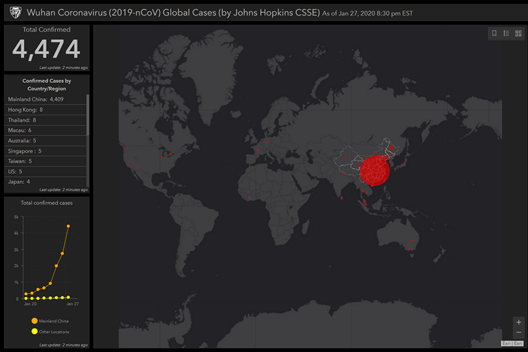
Researchers at Johns Hopkins University’s Center for Systems Science and Engineering have developed a map that tracks the cases of novel coronavirus that is being spread like a wildfire across China and other parts of the world.
The map shows the total number of confirmed cases reported worldwide along with the total deaths and recoveries. It even breaks down the cases based on the spotted region along with a graph that plots the reported cases over time.
The researchers source the data for the map from reputable sources including WHO, U.S. CDC, ECDC China CDC (CCDC), NHC and DXY. Data for China is taken from DXY which aggregates data from CCDC and NHC while estimates for U.S. based cases are taken from the U.S. CDC. Data for other regions are taken from the corresponding regional health departments.
At the time of writing this article, the website notes 4,474 confirmed cases of which 4,409 are from Mainland China. Similarly, Hong Kong and Thailand had 8 cases, Macau had 6, Australia, Singapore, Taiwan, and the US had 5, Malaysia and South Korea had 4, France had 3, Vietnam had 2, Cambodia, Canada, Germany, Ivory Coast, Nepal, and Sri Lanka had 1 case respectively.
The virus – believed to have originated from bats, has caused at least 107 deaths across the globe. In the meantime, the website notes 63 successful recoveries. If you’re interested, you may download the data shown on the website from the Google Sheets provided here.
Do not forget to share this with your friends and family to spread awareness.
View Novel Coronavirus Map
[the_ad id='1307']
Source link
[the_ad id='1307']